OneDrive, the Fluent Design on mobile, here is the new preview interface
Microsoft will soon update the OneDrive apps on iOS and Android with new graphics based on Fluent Design.
Last year, Microsoft announced the expansion of Fluent Design on the OneDrive web client, and in the past few hours has done the same for mobile applications starting with the one for iOS devices.
The acrylic material, perhaps the most distinctive element of Microsoft’s design, will not be available on third-party platforms, but we will find several features that will make the user experience on Windows and mobile more coherent than today.
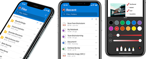
As already happened with other apps in the Office suite, the redesigned OneDrive app for iOS will have a brightly-colored top header bar (in this case blue, similar to the Outlook app). Microsoft Search is now integrated into the app and will allow you to find the files stored on the cloud storage service more conveniently and quickly. Microsoft has also changed the font sizes and colors in the file list screen, all to improve readability and contrast.
The screen of recent files will be offered in an improved version (and more similar to the web client) on the apps for iOS and Android, thus giving the possibility to access the most recently used files in a simpler way (the scans and recently opened PDF files will be proposed at the top of the list, for example). It also improves the on-the-fly PDF editing experience, with the ability to add notes with pen, highlighter and eraser tools. New notes can also be created, which are easier to customize than before.
We don’t know when the new UI will come on iOS, but it seems that Apple’s operating system has a certain priority over Google. On Android, the next few months will have to wait to see the Fluent Design arrive. You can find all the details of the new graphics at this address on the official Microsoft website.


