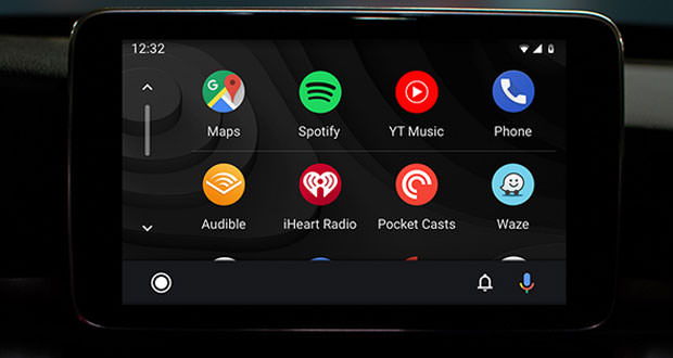
Android Auto changes completely. Here’s how it will be for a few months for everyone
The platform for Google’s infotainment systems for cars completely changes its look. The company gave us a taste of the new look at Google I/O. Here’s how it will be.
Five years after the official debut Android Auto completely changes its look, and the new graphic interface will be offered starting next summer along with new features that should improve the 360° system usability. Google’s infotainment platform is now supported on 500 car models belonging to 50 different brands, and the company’s goal is to grow the ecosystem even further.
On the occasion of Google I/O, Big G unveiled the new design stating that ” the new interface is designed to help the user tackle the roads faster, to show more useful information on a single screen and to simplify the operations more common while driving “. The company has given us the opportunity to savor the news through the presentation in the opening keynote of the Google I/O, and with a video published on the official YouTube channel.
One of the platform’s new features is the ability to view information from multiple apps on a single screen: for example – during navigation or during other activities, it will be possible to control an additional app running through a small lower bar (for example: music playback with Spotify). Moreover, the new launcher and the various screens now have a darker theme and more in line with the interiors of modern cars (though always referring to the typical stylistic canons of Material Design).
Android Auto also changes in the reproduction of notifications regarding incoming calls and messages, and implements a notification center through which it is possible to browse all the notifications received on the smartphone in terms of calls and messages. Google has summarized five main advantages with the new graphics:
- You go on the road faster : the new version of Android Auto as soon as you start the car will continue to play the song that was listening to the user and will show the default navigation app with lots of suggested destinations. The goal can also be set using the voice using the ” Hey Google ” hotword.
- New navigation bar : this element of the interface will allow you to manage two apps simultaneously on the screen. One will be the main one, the other will allow you to perform an additional operation without having to interrupt the first. The new bar will allow you to perform more tasks with fewer taps.
- New notification center : thanks to the new element, Google promises simplified communication management, and in this case of recent calls, messages and notices on arrival. Through the interface, it will be possible to view or listen to the messages, and also respond in a safe manner to the driver.
- New color palette : the new colors on which the updated graphic interface is based are more consistent with those used by car manufacturers for the interiors of their models. The theme uses darker colors, even if embellished with colored elements and characters that are easier to read.
- Better adaptation to different formats : not all cars have displays of equal size, and with the next Android Auto version, will be able to adapt dynamically to various formats to show more useful information for passengers and drivers.

