Android Auto: New design coming soon
After the announcement by Google of an upcoming restyling of the Android Auto interface, the first images of users who have obtained the update are coming. Let’s see the new screen!
For Android Auto, there is a big redesign of the interface and the experience that the application can offer. Announced in May, it was later mistakenly released on some cars in June, Android Auto is finally ready to officially come out in the open with the new interface.
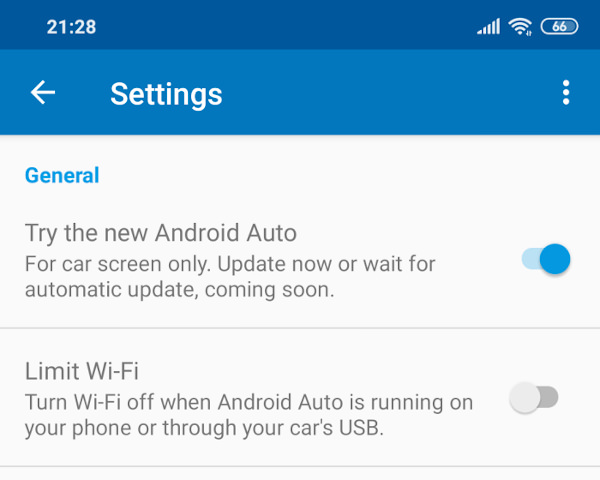
Some users on Reddit have reported a new button in the application: ” Try the new Android Auto “, an update available via this button or waiting for an automatic update. The version that makes the update available is v4.5.5928 and some users have revealed that they have managed to update only by deleting the cache and the app data.
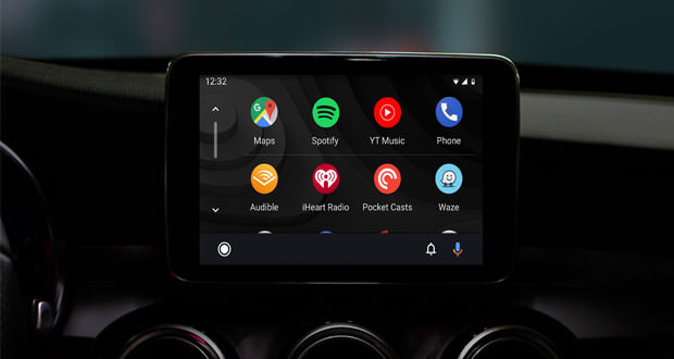
The most obvious update of the interface is the dark theme, and a ” navigation ” within the slightly revised application. There is a new launcher with recent apps at the top and all the other apps at the bottom in a grid; a new navigation bar with the Home button on the far left and depending on the context, there are multimedia controls or directions or buttons for incoming calls. A shortcut on the left allows you to switch to apps to browse media files.
To complete the navigation bar, there is a microphone for the Google Assistant voice commands and a bell-shaped icon, the latter offers the possibility to check notifications and received calls. The notifications can be viewed through a pop-up that appears on the interface.


