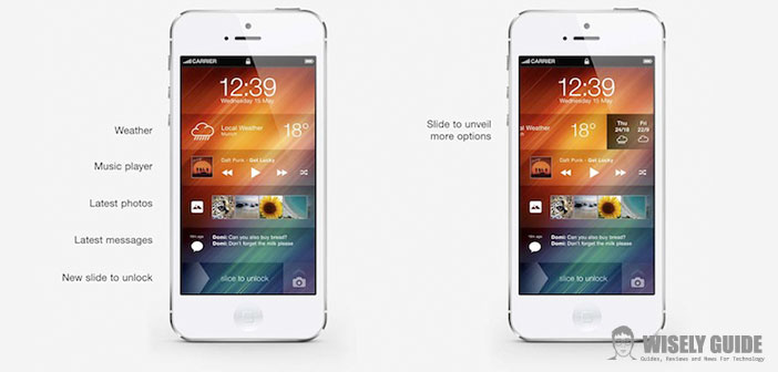
That stuff is the flat design? If you are asked for some not all experts in the field when you started talking about the new Apple operating system, iOS 7 that, as we told you recently, is now fully usable. On the design ” flat ” Jony Ive, you play the career, but apparently the audience of loyalists is giving a reason. So let’s see what are the principles of the flat design.
1.) Minimalism. – There’s just what you need. All additions disappear, unless they are necessary. In a sense, the rule of the flat design is to focus on the primary objective of the design itself: solve problems.
2.) Simple elements and basic. – Simplicity is one of the golden rules and the flat design, so every element of the interface must have a unique interpretation. This, to say the truth, Apple has always been a teacher.
3.) Zero effects. Unlike the skeuomorphism that Apple had accustomed us, there’s the search for imitation of reality in an attempt to ” create ” objects through special effects. The flat design drawings, such as animations, are simple: a color, a movement. Think of the calculator keys or keyboard in iOS 7 will not have been more three-dimensional, but they are flat.
4.) Vibrant colors. Took everything, were practically the only colors that are fundamental. To this are vibrated and clear and become an instrument for guiding the use of smartphones. An example: in the settings of iOS 7 hours each entry is distinguished by its small icon colorful. The colors on which the flat designs are primary and secondary, avoiding to usually go further. With some exceptions, such as for folders that I keep repeating, are just atrocious because of that purple-blue gradient studied by the son of Jony. In any case, the colors are all there, in the color wheel of the app photos.
5.) Attention to typography. Removed everything, in addition to color remain the lettering, that Steve Jobs adored. No coincidence that Apple has corrected the font used almost immediately, adopting the clearest Helvetica Neue.

