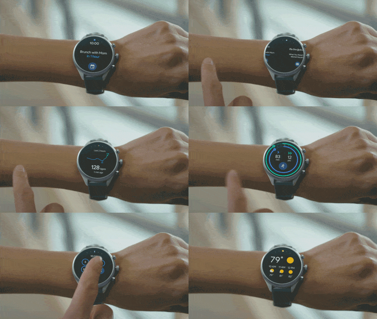
Wear OS: the new Tile interface is based on swipes
The Wear OS interface is ready for a new update, it is a system based on ” tiles ” side by side accessible by swipe to the left.
Google announced its latest Wear OS based on Tiles, which we could translate into Italian as ” cards ” or ” cards “, and is starting to get to many smartwatches that use this operating system.
The purpose of Google is to more easily access what you need to know and get off your wrist. In recent months, new designs have been introduced that offer access to Google Fit tips and help from the Google Assistant.
As you can see from the GIF, the tabs that can be viewed are those concerning goals, events, weather forecasts, heart rate, news and timers.
Through swipes to the left, you will have access to these cards, having at a glance the information we need on that card.
Obviously, it will be possible to personalize the cards to be displayed, arranging them in the preferred order: to do so, simply press and hold the card on the smartwatch to move it or touch it and drag it to the position you want to add it to your favorite cards. According to Google, this will allow us to stay connected to what is most important to us, keeping our information under control; the Mountain View company ensures that more cards will be available in the future.
According to the company, the Wear OS update will be released next month, and some features will change based on the country. Despite this, on
Reddit, some users claim that their smartwatches have already been updated to the new Tiles system; the update to version 2.24 both on the clock and on the phone should guarantee the transition to the new interface, but there is nothing that can be done to force the update.
Some already updated smartwatches are: Fossil Sport, Huawei Watch 2, Ticwatch Pro, Ticwatch E, Misfit Vapor and some others. Personally, I tried to update both my Ticwatch E and Wear OS app to the latest version, but I didn’t get the new Tiles system, in case we got updates we will update the post.


